

There’s a new tab in the User dashboard, and it does the one thing every admin has quietly wished for while scrolling through transaction history like it’s a crime scene: it just tells you the numbers.
The Revenue tab breaks down everything a user has ever purchased, split by product type, and hands it to you three different ways depending on how you like your data served.
What’s In The Tab
Total Revenue Card
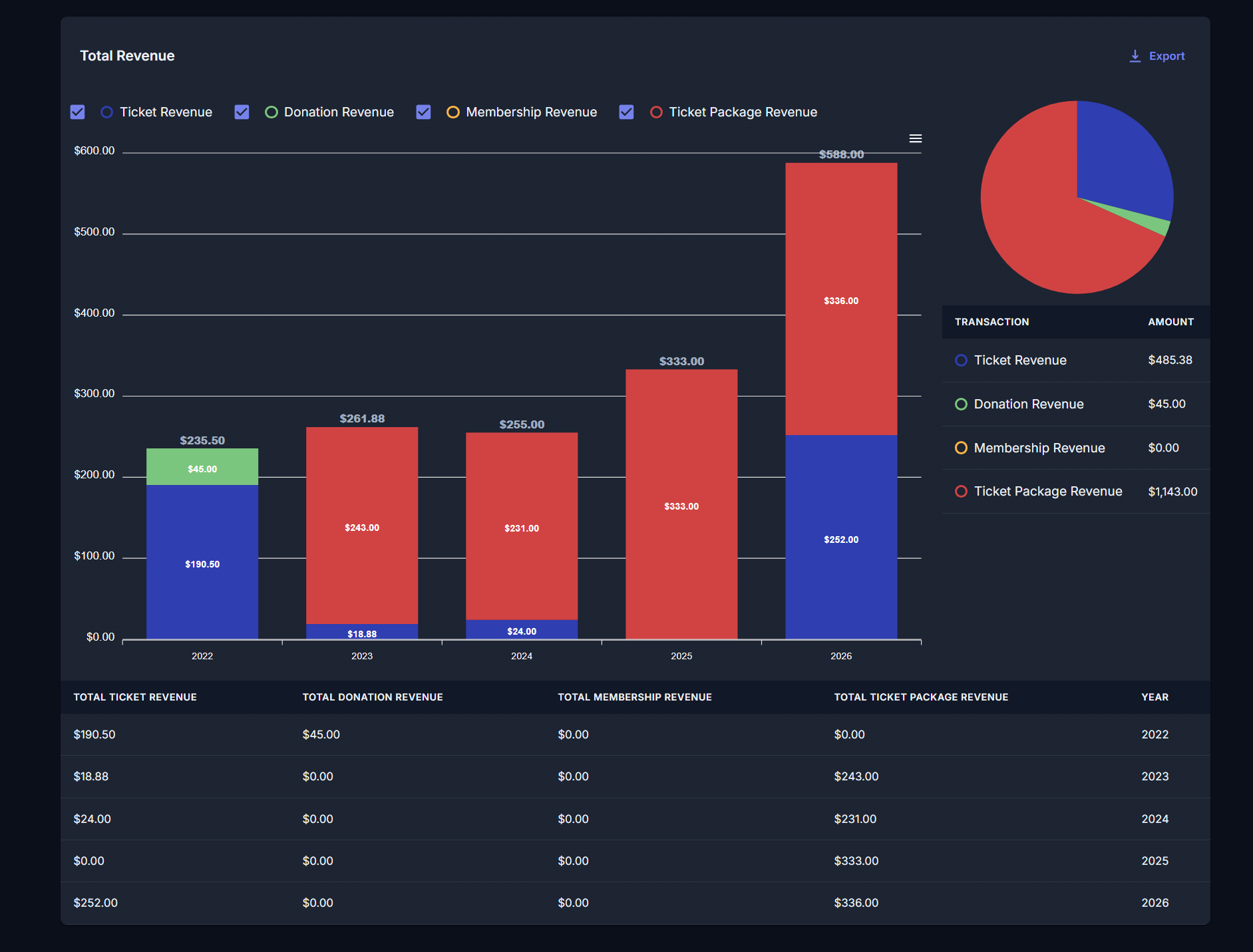
This one’s the overview. A bar chart shows totals per product type for every year the user has a transaction on record, and you can show or hide product types to declutter the view (everything’s visible by default). Next to it, a pie chart shows that user’s lifetime total by product type. Below both, a data table repeats the same numbers in table form, because some people trust rows more than they trust bars.
Annual Product Averages Card
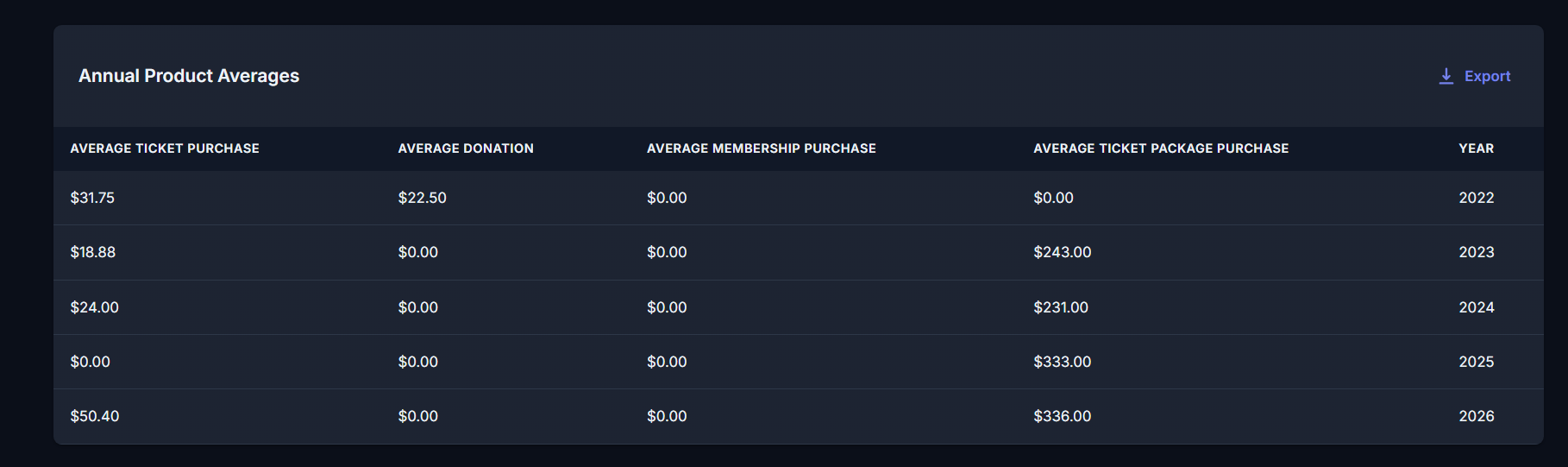
A straightforward table showing average spend per product type, broken out by year. No chart theatrics here. Just the numbers, sorted the way you’d want them.
Largest Transactions Card
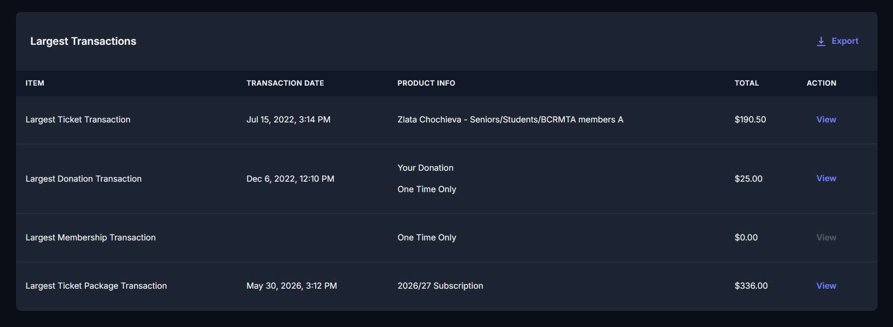
This surfaces the single largest transaction per product type. Useful for spotting your biggest single-purchase moments without digging through every order a user’s ever placed.
Get The Data Out
Every card comes with a CSV download and a print option. CSV exports the table content only, no chart images along for the ride. Print generates a PDF of the card, so you can hand it off, file it, or stare at it in a format that isn’t a browser tab.
Next Steps
Want to see how this fits into your workflow? Book a personalized demo and we’ll walk through it together.